Friday 16 December 2011

Thursday 24 November 2011

Portraits.


As part of photography club we were encouraged to take some portrait shots of our two models...

Sunday 9 October 2011

I recently moved to the countryside and I try to make the most of the amazing landscape around me. I go for walks round my area regularly and take some photos of whatever attracts my eye.


This silhouette shot makes me think about Halloween. I particularly like how the shapes of the branches are so intricate.


 I took a shot of this bark because I really liked the quality of the colours and how they really represent autumn and winter.


This is a more linear silhouette shot. I think the big tree in the middle breaks the photo up a bit and makes it more interesting.


I took a photo of this bark because the shape was so odd and mangled.


I edited a photo of some more silhouette shots I took, I wanted to see what kind of atmosphere changed when the colours were inversed. I used Fotoflexer and found that blue made the photo less eerie but created a colder atmosphere whereas the red changed the mood to make it hotter and more mysterious.


A country lane in Market Harborough.


This is my favourite photo of them all, I will be creating a project on this photo.

Happy blogging!


Friday 7 October 2011

The Killers at Hyde Park

In June 2011, The Killers (my favourite band) came to Hyde Park! It was a massive evening and I got a real feel for outdoor concerts, there were some .. interesting sights and smells but most of all the music was amazing. I can't wait to go again!


In the first few seconds of The Killers' appearance, I took this photo of the beautiful lead singer: Brandon Flowers.


I really liked the way this image completely captures the atmosphere of the evening. Everyone was happy and having an amazing time, the light adds a kind of glow to the photo, which makes it even more of a magic night! This is Mark playing the guitar, I love his hair!


Shortly after the previous photo was taken, the stage became full of glitter! The confetti came everywhere and really made the whole evening light up. I loved it!


This close up of the stage is quite different, the lighting makes the shadows more visible and more stunning.


Another close up of the stage with different graphic backgrounds.


This was taken as the band began to play one of my old favourite songs: Bones.


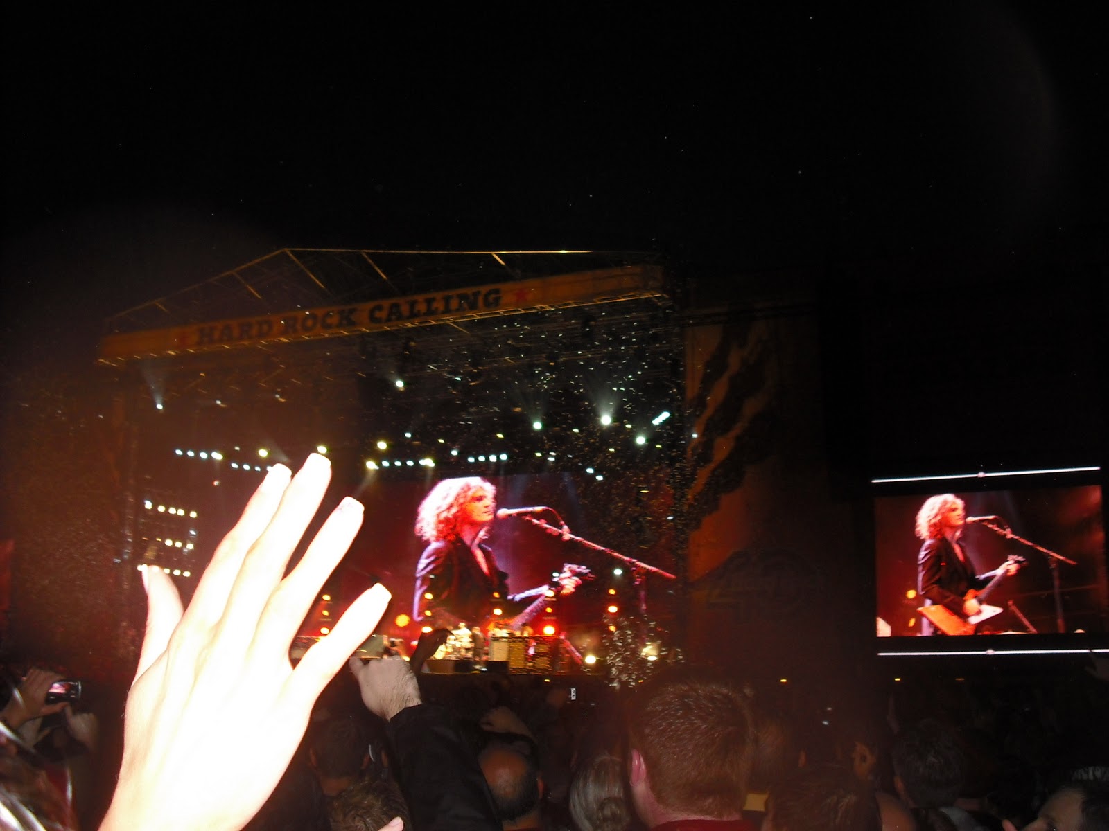
I like how this is a semi-action shot of Monkey Man playing the drums, as well as the stage where Brandon and Mark and David were playing amazingly.


This photo is similar to the previous one, but the lighting is more interesting and the side screen has a better angle of the guitar that Brandon Flowers' main man has.


The lasers came on! This has quite a 90s escstasy feel to it (so I've been told).


These two photos are part of the confetti finale as 'When you were young' and 'Spaceman' were being played.


The last fireworks, closing off one of the best events of my life so far!

Happy blogging!


Wednesday 31 August 2011

Paris - non, je ne regrette rien.

I love France and with Paris being the capital. I recently went on a short trip there and armed with my camera I wanted to photograph everything that was iconic in the beautiful city.


Starting with this picture, the iconic and romantic boulevards were one of the first things I looked for and this one near the river Seine captured my eye.


The BHV, the architecture here is awesome.


The more modern and funky Cartier Latin - the perfect place to get a kebab, and find a Turkish boyfriend(!)


Old meets new in this black and white shot. The metro is definitely the way to go if you want to get anywhere..


 My little brother enjoys a ride around a surprisingly empty street, looking very French as he should.


It's culture, right?


A quick snap shot of the metro as it arrives to take passengers around the beautiful city.


Near Notre Dame I saw lots of buskers including this typically Parisian man who played edited versions of 1950s French classics.
My trip to Paris was a brilliant one - I'm lucky to be near to such a wonderful country!

Thursday 25 August 2011

Kimono, kimono, kimono!

Over the past year, I have worked very hard on my favourite project so far. It is a Japanese infused coursework and I have taken much time and much interest in it.

It started off with Hokusai. I was working on painting waves, and the way in which he portrayed them was beautiful. I created my own wave pattern based on him and created a painting in his style.

Following this, I wanted to explore Japanese art further. This took me to printing.

Here are some prints I did based on an acetate taken from the top section of my painting:


These two prints were my final pieces. I achieved this rather unique look by printing on the wave pattern and then washing in the colour with fabric dye that had been diluted. To keep it fresh, I used some wax crayon in white to draw in a few lines around the print, by doing this, it created resistance to the dye and added an interesting effect.

This is my favourite of the two prints. I love the bright colours, it screams 60s psychadelia and led me on to doing a sub project on the 60s.

Still unsatisfied and hungry for more Japanese art, I explored into the wide land of fashion! The Japanese kimono seemed like a fantastic opportunity to learn about textiles and dress making. I wanted to keep it the same as the way the prints were made to stay true to my ideas.

                       The final product!


After I had finished my kimono, I decided to go back to the 60s psychadelic look. After some research I noticed there was a trend of.. TIE DYE! Loving the colours and crazy theme, I embarked on a tie-dye mission.


 In the making...


My final psychadelic project, I hope there will be many more!


Doors - what do they show?

I am new to the world of blogging. I opened this blog in order to expand my art course work and to use different medias, over the course of my blogging life (which begins now) I will post photos of my art and what I do. At the moment I am working on a project based on doors and what they can lead to. Enjoy!

This door was found on a restaurant in my local town called Market Harborough. I like the colour scheme of it, and how the glass is extrememly reflective. The colours aren't warm, but different, and somehow inviting.


This door caught my eye because it was surrounded by a huge developement of modern homes in Market Harborough. The brickwork above the door was particularly interesting, as was the stone display around the sides of the door.


I saw this door in a neighboring village called Clipston. The way it was surrounded by trees, as well as having dark panelled glass and steps leading towards it made it quite mysterious and foreboding..


This door struck me as being really cute. With it's blue paint, and miniature glass windows it reminded me of a beach side hut (except the fact that it was in the middle of the country side in East Farndon)!


This door makes a really beautiful entrance to the house. Situated in a local village called East Farndon, I find the matching plant pots are really tasteful. The whole porch says a lot about it's owner: judged on appearances!

I decided to photograph this door because despite being the same colour as the door above, it gives off a very different message. I find it hard to imagine the people who live in this home - either very old, or very young. The twisted and untame ivy and other creeper plants give it a very cottagey feel, I can see it would be the most perfect place to spend cold Christmas evenings in!

Church doors are always different. This one (Our Lady of Victories) is quite modern, but the stained-glass windows have been put in place when the church was renovated. I like the fact that this church uses paler wood than most, and it seems clean and welcoming, quite unlike the cemetery-style churches people usually think of!
This church gate left a lot to be imagined! From Saint Dionysus Church in Market Harborough I found this door very daunting, even by standing in front of it I felt it's presence! The tough iron gate adds particular effect. This door seems odd for a place of worship and begs the question of what used to happen in churches before my time..


The theatre door is a very basic door. It does not display any sign of grandeure or luxury, which is odd seeing as theatre's are usually places for people who have the money to enjoy leisurely activities.


I love the rugged look to this door. Despite it being the most modern door on this blog so far, it seems to be the most worn down. I don't know what this says about society nowadays but it certainly says a lot about the quality of buildings of the modern century.

I found that the door above was very rugged and unmaintained. I decided to edit it some more to create something more interesting. The pink colour is very feminine which contrasts greatly to the rough style the door gives.

Thank you for taking the time to read this blog, I hope it has interested you as much as it has helped me to put my ideas forward in a creative way.

Happy blogging!